Give your button the class of button-animated-icon and use the following CSS:
.button-animated-icon .gb-icon {
	transition: all 0.2s ease-out;
}

.button-animated-icon:hover .gb-icon {
	padding-left: .8em;
}
Tweaks for GeneratePress & GenerateBlocks
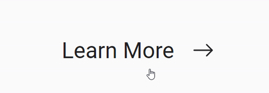
Create a simple animation with a icon button.
Give your button the class of button-animated-icon and use the following CSS:
.button-animated-icon .gb-icon {
transition: all 0.2s ease-out;
}
.button-animated-icon:hover .gb-icon {
padding-left: .8em;
}
Kyle Van Deusen
Co-founder of The Admin Bar Community, owner of OGAL Web Design, and a GeneratePress & GenerateBlocks enthusiast.
Hey Kyle! Just stumbled upon this article.
It’s a cool trick, but given how expensive it is for the browser rendering engine to re-draw the layout, and how browsers are optimizing the transform properties, you’re almost always better off animating (or transitioning) those properties instead of padding.
This is how I usually approach it:
“`
.button-animated-icon .gb-icon {
transition: transform 0.2s ease-out;
}
.button-animated-icon:hover .gb-icon {
transform: translateX(.8em);
}
“`
Note we’re also declaring the transition solely for the property we actually need it on — this also contributes to better performance.
Cheers!